If you'd like to get in touch, please do using the details below.

Get In Touch

Phone

07508 393295

About the project

The Smith + Henderson website faced critical challenges that were impacting their digital presence. A thorough analysis of user analytics revealed concerning trends: declining visitor numbers, poor engagement metrics, and a steadily dropping search ranking. These issues stemmed from an outdated web infrastructure that was holding the business back.

The non-responsive design was failing to serve the growing number of mobile users, while poor site architecture made it difficult for both visitors and search engines to navigate effectively. Most concerning was the outdated platform, which had created significant security vulnerabilities that put both the business and its users at risk. The combination of poor mobile optimisation and suboptimal site structure was severely impacting the website's search engine rankings. This meant potential clients weren't finding Smith + Henderson when searching for their services, directly affecting their business growth potential.

Client: Smith + Henderson

My Role: I lead the re-design and re-development of the Smith + Henderson website focussing on mobile first design and SEO rankings.

Summary:
UX Design
UI Design
Information Architecture
Custom WordPress Development

Goal 1

Improve online customer experience by providing an easier to navigate website

Goal 2

Bring the design up to date by creating a clean, fresh and modern look and feel

Goal 3

Create a fully responsive website so users are able to easily browse on their mobile devices

Goal 4

Improve overall SEO and Google ranking through structured content and well built pages

Goal 5

Improve the stability and security of the website to reduce downtime and vulnerability

Goal 6

Provide continuous UX improvements, support and back end maintenance

User Research Methods Used

Service blueprints

A service blueprint was created to visualise and understand key customer touch points and internal processes involved

Customer journey map

I explored the multiple steps taken by a customer to engage with the website and complete key goals

Personas

I highlighted key user demographics and created personas to help empathise with users

Competitor analysis

I compared competitor products and websites to identify and understand opportunities and industry standards

User flow diagram

I created a visual representation of the current user’s flow to identify which steps could be improved or redesigned

IA

I performed card sorting workshops with users then tree tested the new navigation to validate the new IA

Content audit

I listed all content available on the current website, and worked to "keep, kill or consolidate" in line with the new IA

Sitemap

I created a diagram of the website’s pages organised hierarchically to visualise the new structure and navigation

Usability testing

I performed one-to-one remote interviews with users to validate and feedback on the new flow, design and features

Testing Results

Usability testing showed that users wanted a simple navigation, clear content, and to be able to access the website on their mobiles.​ ​ I conducted additional usability testing with the same tasks with the new design and IA, which showed an increase in customer satisfaction compared to previous round of testing as users were able to easily navigate to the information the wanted, on any device they chose.

Final Reflections

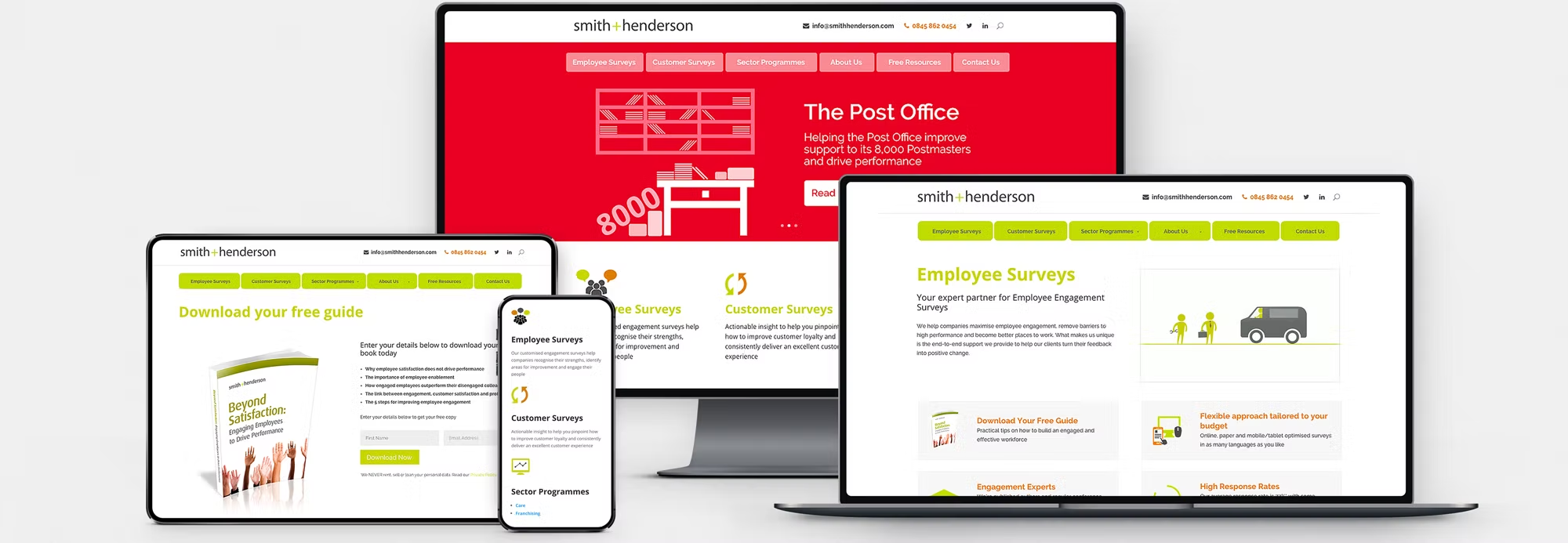
During ideation, we went through several different design concepts that ultimately did not completely satisfy user needs. One design concept that we prototyped displayed the lots of information consolidated onto one page. User feedback was that this was too long to digest easily, especially on mobile, so we separated it out over different pages. ​ Because users were now able to navigate the site easily, was mobile friendly, and built on a more stable and secure platform, SEO improved significantly with the site appearing higher up on Google rankings.