If you'd like to get in touch, please do using the details below.

Get In Touch

Phone

07508 393295

About the project

The Healthera iOS application had become out of date, lacked finesse and was resulting in users not actively using the app.

Based on a review of the current app, we hypothesised that the lack of user instruction, difficult navigation and dated look and feel resulted in the drop off of users and lack of uptake by pharmacies and by giving the app a new UI we would be able to drive more engagement and pharmacy sign ups.

Client: Healthera

My Role: I lead the end to end re-design of the Healthera mobile application from user research and discovery through to the delivery of final UI designs

Summary:
User Research & Testing
UX Design
UI Design
Illustration

Goal 1

Improve overall customer experience by providing an easier to use and engaging app

Goal 2

Bring the design up to date by creating a clean, fresh and modern look and feel

Goal 3

Guide users on how to use the app with clear step by step instructions to avoid confusion

Goal 4

Bring the App Store rating up to at least 4 stars with many positive user reviews

Goal 5

Introduce a more "fun" user experience to make users want to continue to use the app

Goal 6

Make it as easy as possible for users to stay on top of their medication adherence

User Research Methods Used

Service blueprints

A service blueprint was created to visualise and understand key customer touch points and internal processes involved

Customer journey map

I explored the multiple steps taken by a customer to download and use the app successfully to identify any pain points

Personas

I highlighted key user demographics (even pets!) and created personas to help empathise with users

Competitor analysis

I compared competitor products and apps to identify and understand opportunities and industry standards

User flow diagram

I created a visual representation of the ideal user flow within the app to identify which steps could be improved or redesigned

Content audit

I listed all current screens and worked to "keep, kill or consolidate" in line with the new user flow

Sitemap

I created a diagram of the new app screens organised hierarchically to visualise the new structure and navigation

Sketches

I created simple hand drawn sketches to validate my concepts and design approaches both with team members and users

Usability testing

I performed one-to-one remote interviews with users to validate and feedback on the new flow, design and features

Testing Results

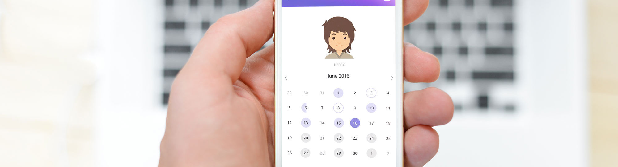
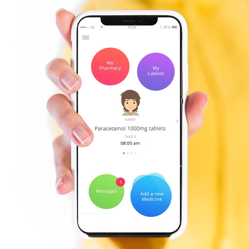
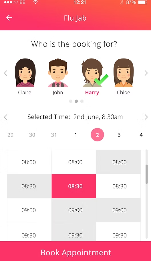
Speaking with users identified the need for additional user types that we hadn't thought of, such as a parent monitoring a child's medication, or even a pet owner monitoring their dog's! ​ When conducting user testing of conceptual designs, these additional user types were well received and users said it gave the app a much more personalised experience.

Final Reflections

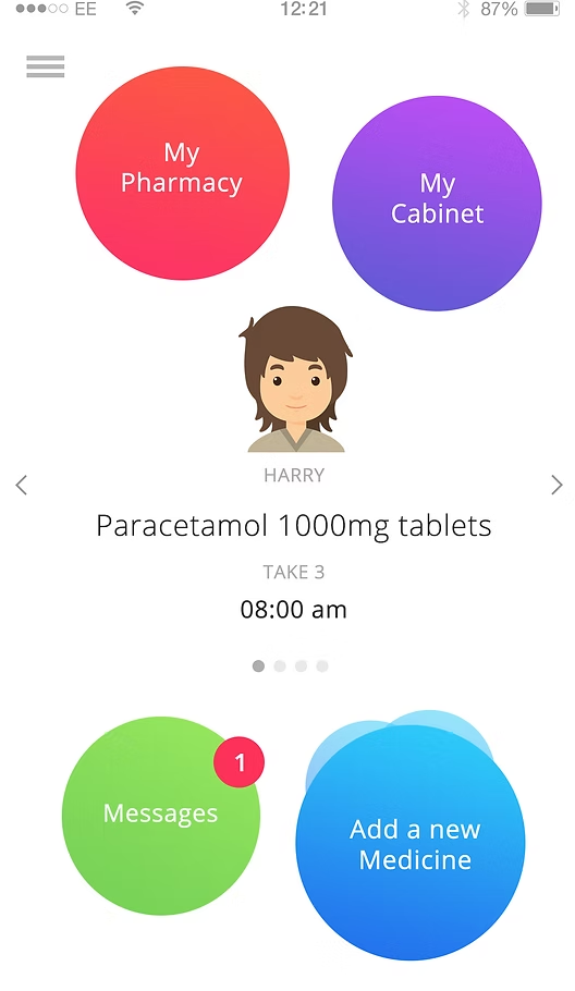
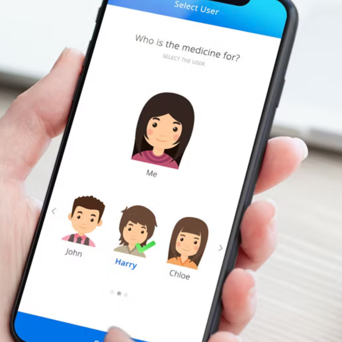
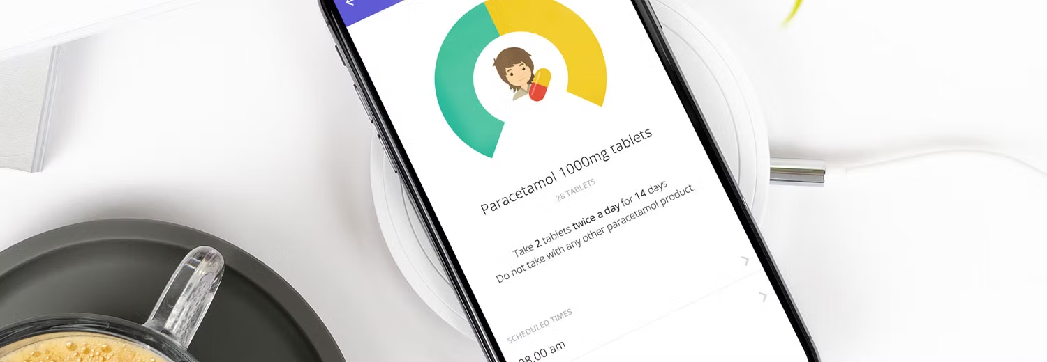
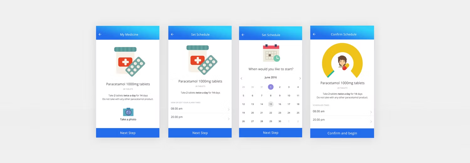
During ideation, we experimented with a few different look and feel options. The initial approach was to keep it "clean and green" however when testing with users this didn't tick the engaging, fun or personal feel we were after. ​ We then introduced the concept of avatars and bolder colours for a more playful feel, and re-tested with users. The app was very well received and is now receiving 4+ star reviews on the app store